
Culinary Hub Brand Identity & Website Design for Diverse Dining Market in Milwaukee
Services identity, branding, website design, social media, illustration, and brand strategy
Diverse Dining Market faced a fundamental branding challenge: how do you visually communicate cultural diversity, community support, and culinary authenticity without falling into cliché or visual noise?
As a rotating culinary hub in Milwaukee's East Town featuring local food vendors from various cultural backgrounds, DDM needed to:
Stand out in Milwaukee's growing food scene while authentically representing multiple cuisines and cultures simultaneously
Signal their mission visually: Supporting small food-based entrepreneurs and fostering community through diverse culinary experiences
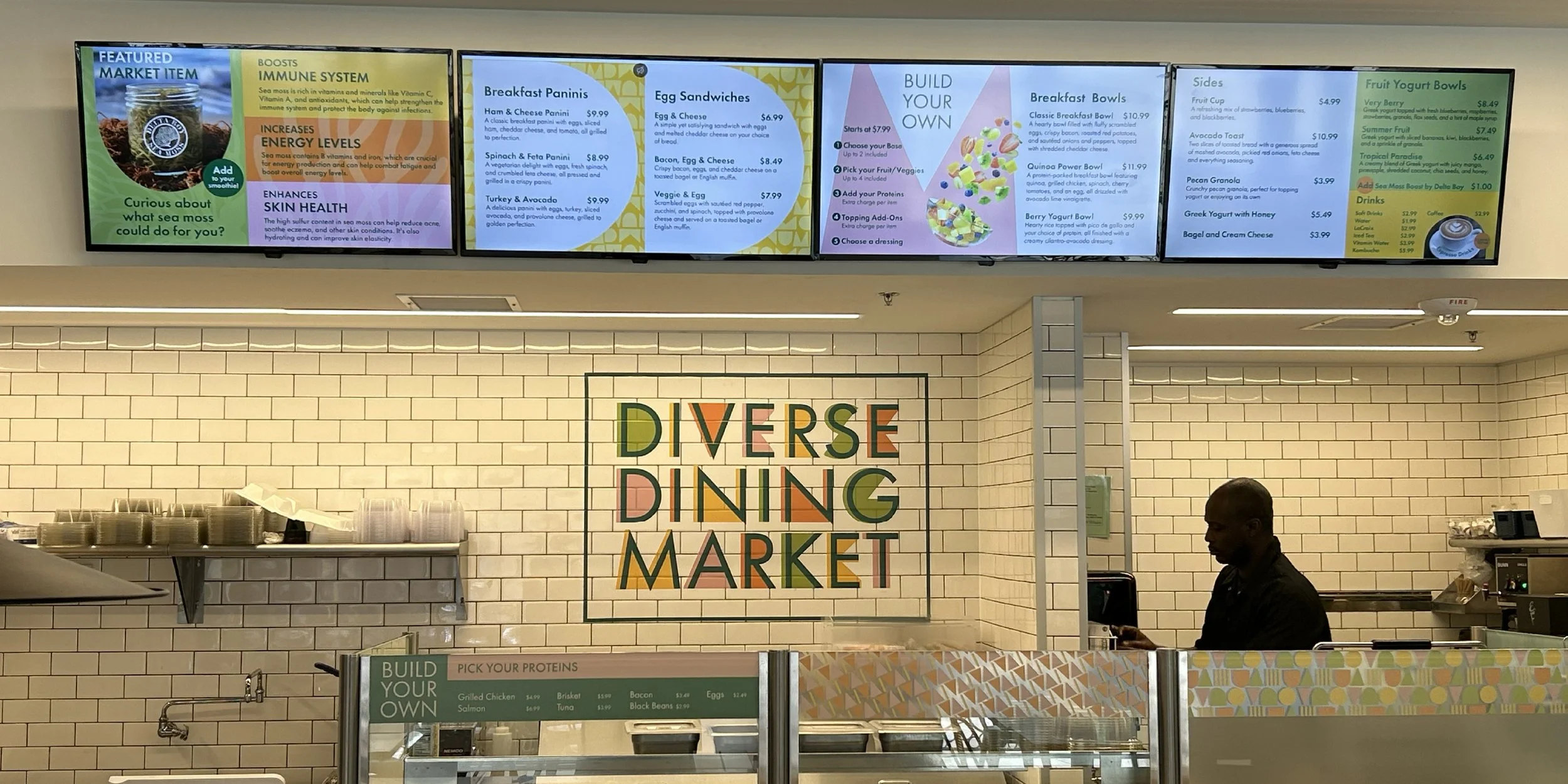
Create cohesive brand presence across physical space, digital platforms, vendor collaborations, and event marketing
Appeal to both vendors and customers: The brand needed to attract adventurous diners while giving vendor partners confidence in professional presentation
Without a strategic visual identity, DDM risked looking like just another restaurant or appearing fragmented across their various touchpoints. The alternative (generic food photography with standard typography) wouldn't differentiate them or communicate their deeper community mission. They needed a visual system that could flex across cultures while maintaining brand coherence.

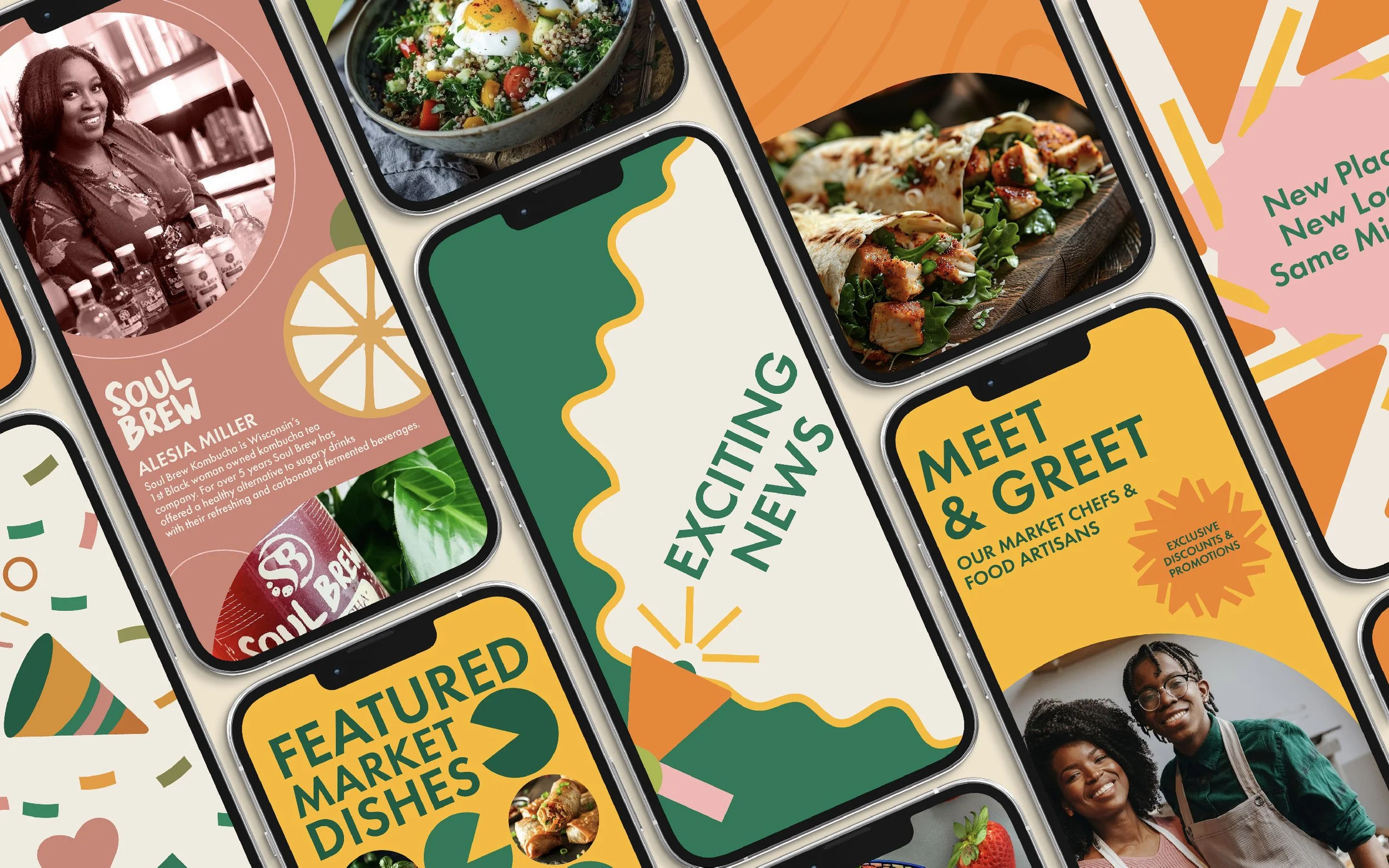
Solution: Abstract Architecture That Celebrates Diversity Without Stereotyping
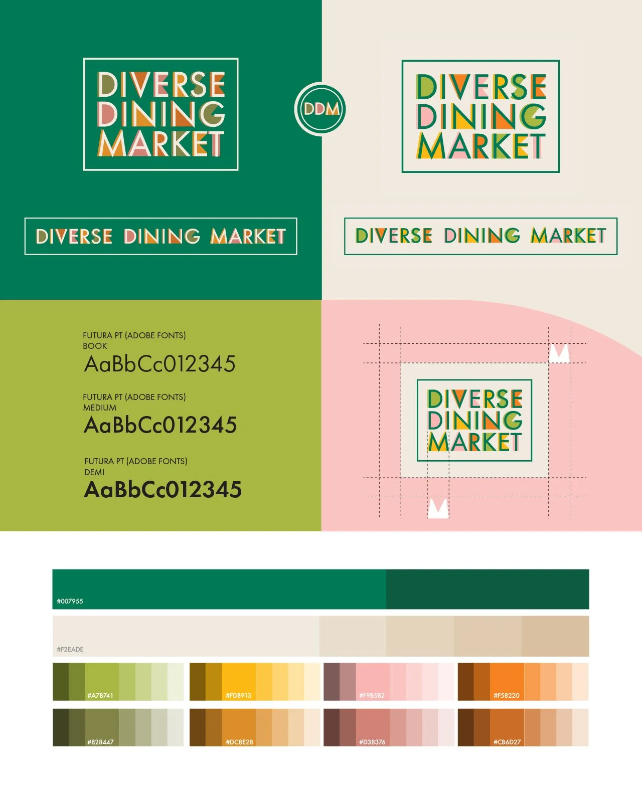
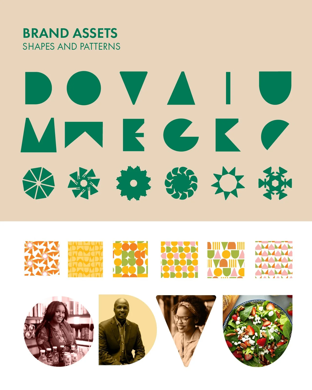
We developed a complete brand identity system built on a distinctive visual language: clean typography layered over colorful, abstract shapes. This approach solved the core strategic challenge of representing diversity without relying on cultural stereotypes or creating visual chaos.
The Strategic Framework:
Wordmark foundation: Clean, accessible typography that ensures legibility across all applications while providing a stable anchor point
Abstract shape system: Colorful, geometric forms that symbolize the vibrant, varied community DDM serves without dictating specific cultural references
Food-inspired color palette: Bright and muted hues drawn from fresh ingredients, creating visual appetite appeal while reinforcing the culinary focus
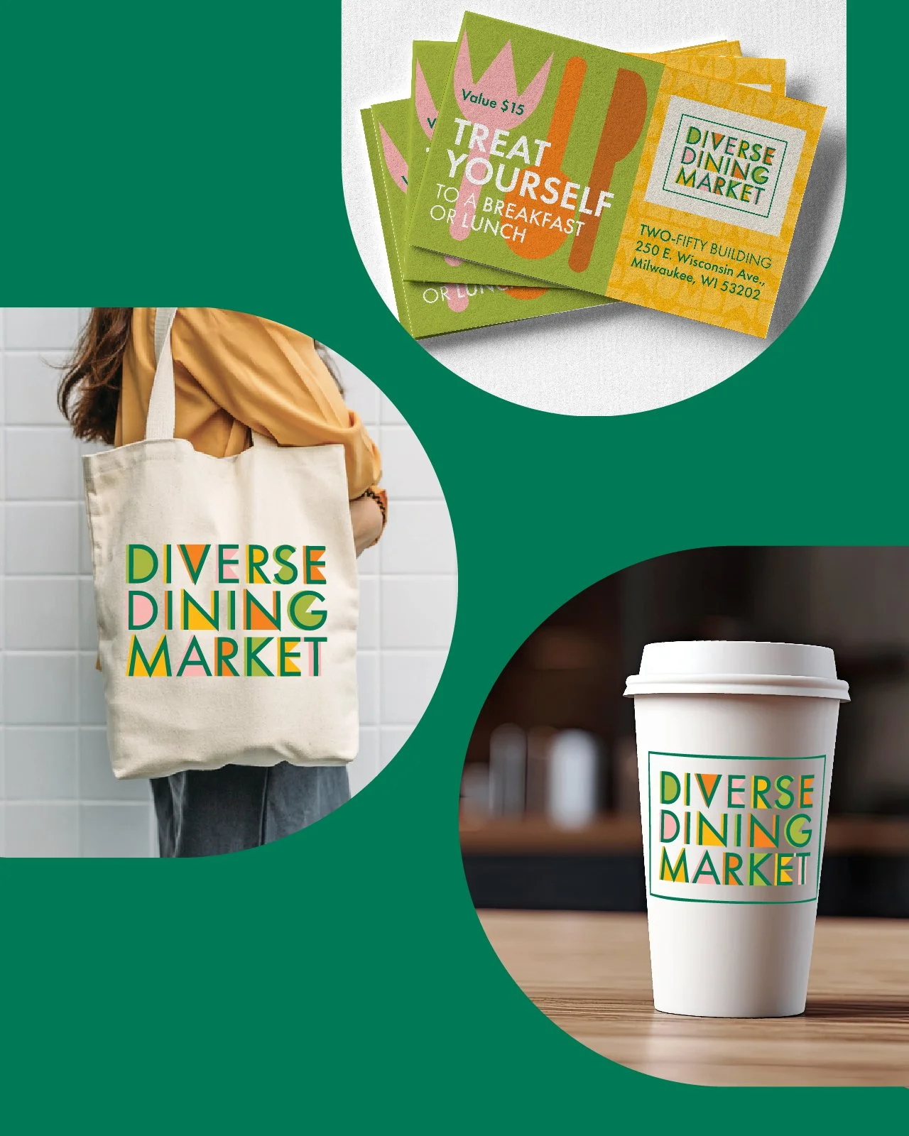
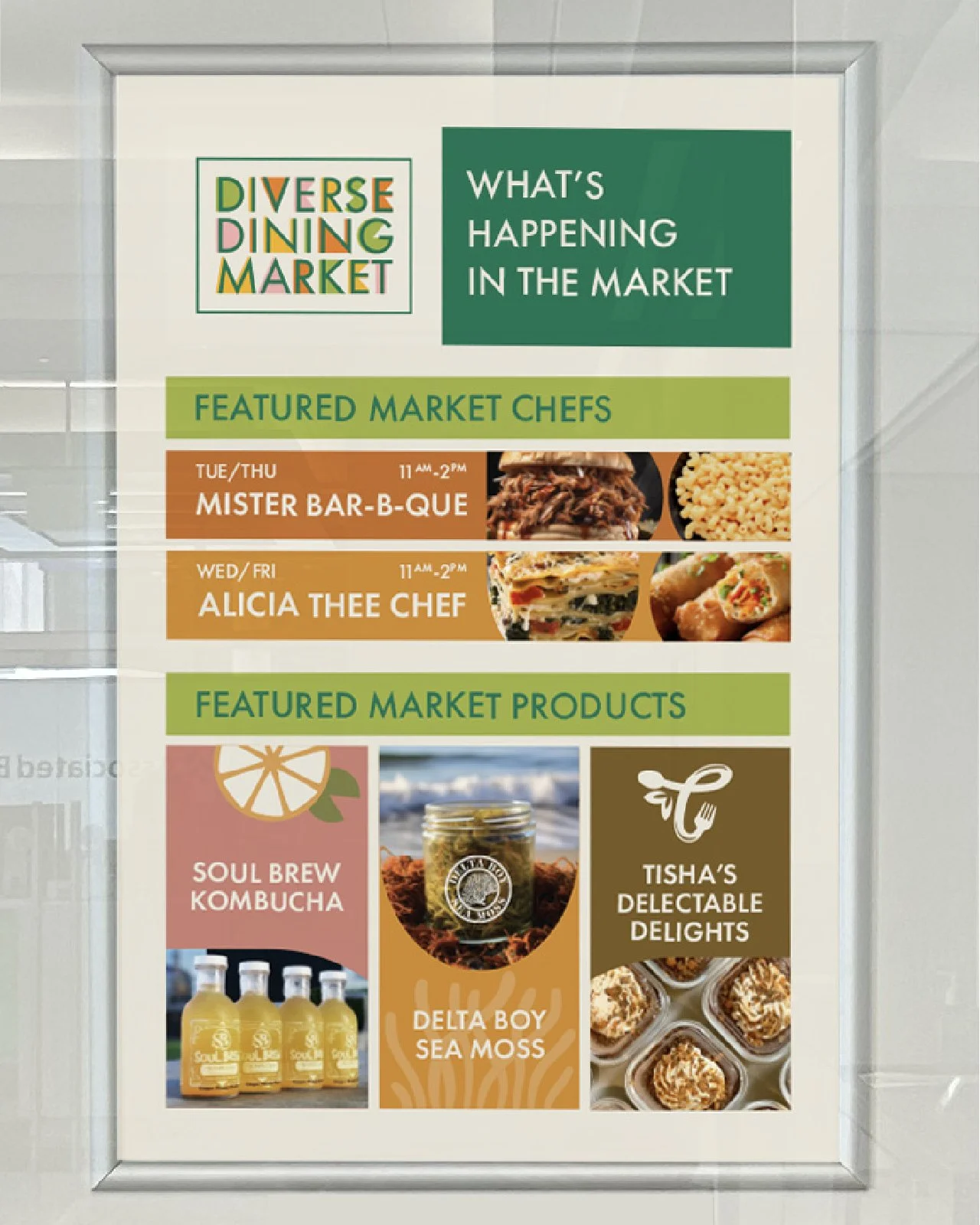
Flexible brand illustration system: Shape-based forms that integrate seamlessly with vendor photos, event imagery, and in-store visuals
Impact: A Visual Identity That Grows With the Community
The comprehensive brand identity system delivered:
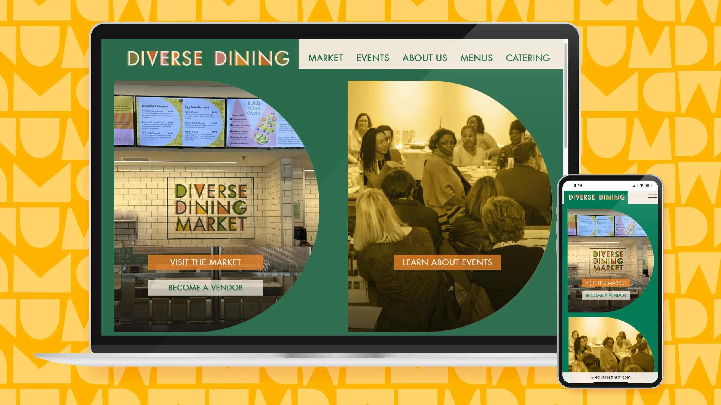
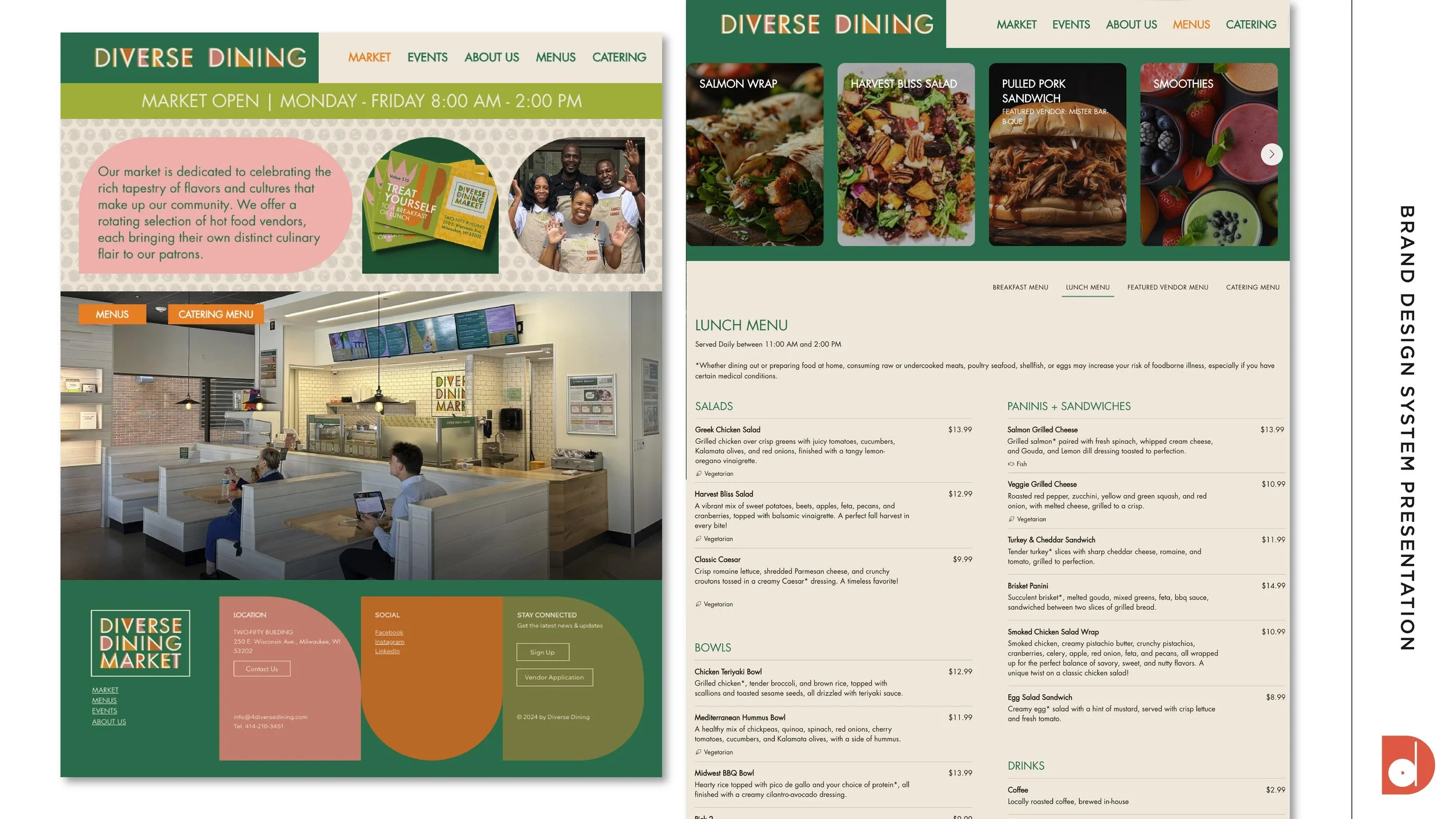
Unified multi-platform presence: Consistent brand expression across physical space, website, social media, and event marketing
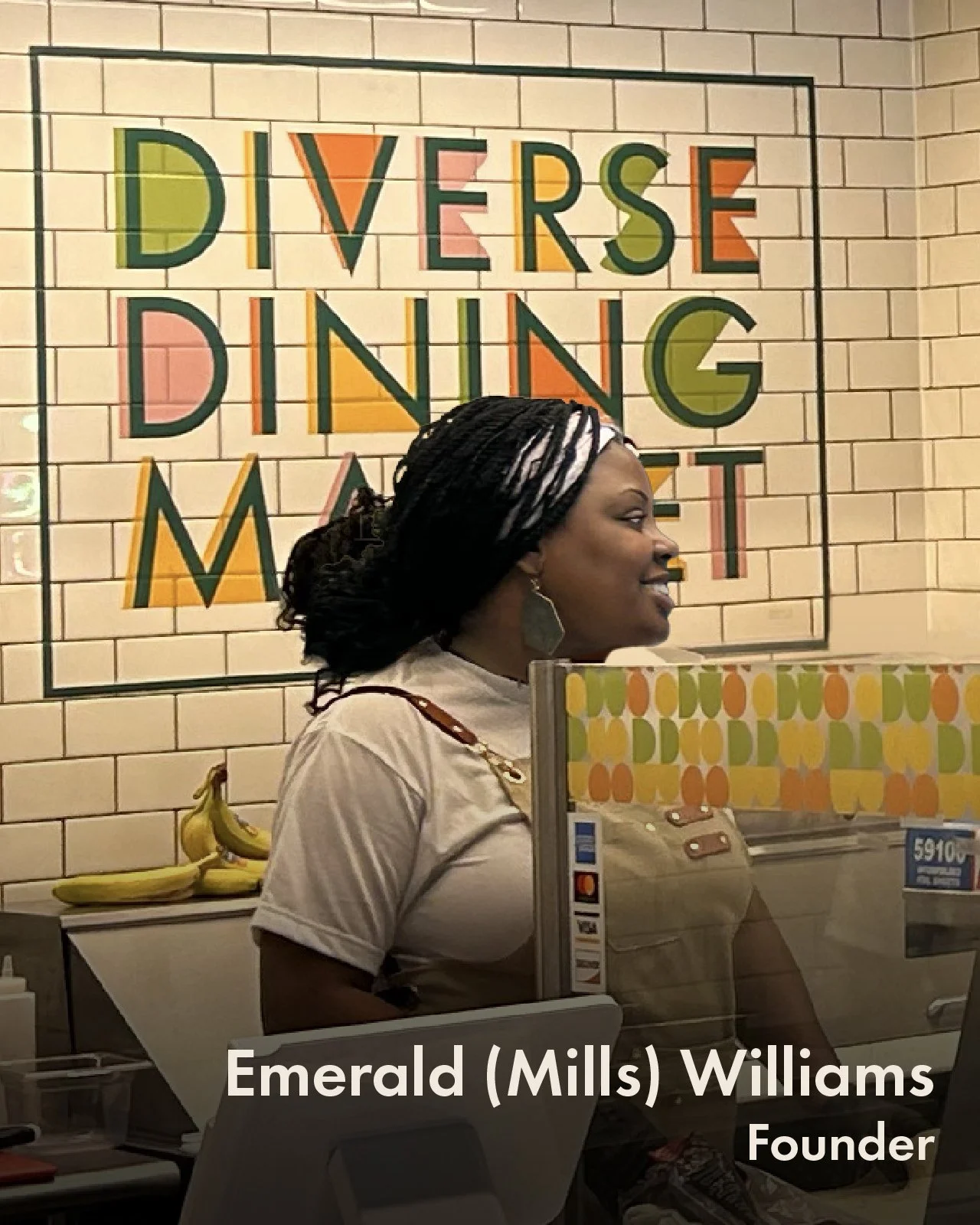
Vendor confidence: Professional visual system that elevates partner businesses without overshadowing individual identities
Authentic differentiation: Visual language that communicates community mission and cultural diversity in Milwaukee's competitive food market
Scalable flexibility: Playful, friendly, timeless brand illustrations that work across rotating vendor lineups and evolving programming
Relationship-oriented presentation: Visual warmth that reflects DDM's authentic, community-focused approach
Diverse Dining Market now has a visual identity that performs like their mission: bringing diverse voices together under one cohesive, welcoming, and professionally presented brand experience.
Social Media Design Collaborator Yaritza Montelongo