Premium Confectionery Brand Identity & Logo Redesign for That's Right, Sweetie
Services Brand Strategy, Identity Redesign, Packaging Design, Digital Assets, Print Collateral
“Working with Amy from Dig Design on Stacy’s rebrand for That’s Right, Sweetie was such a relief. She brought not just design expertise, but true project management skill - from researching printers and pricing to handling the details I wouldn’t have thought of. We were on a quick timeline under pressure, yet Amy made the process feel smooth... even enjoyable. Her thoughtful recommendations and ability to guide the project made a huge difference. I felt supported and confident throughout, never like I had to ‘babysit’ - which is a huge differentiator when working with partners. Amy turned what could have been incredibly stressful into something seamless.”
Jen Adamski
Principal
Klario - Marketing That Moves You Forward
www.KlarioCreative.com
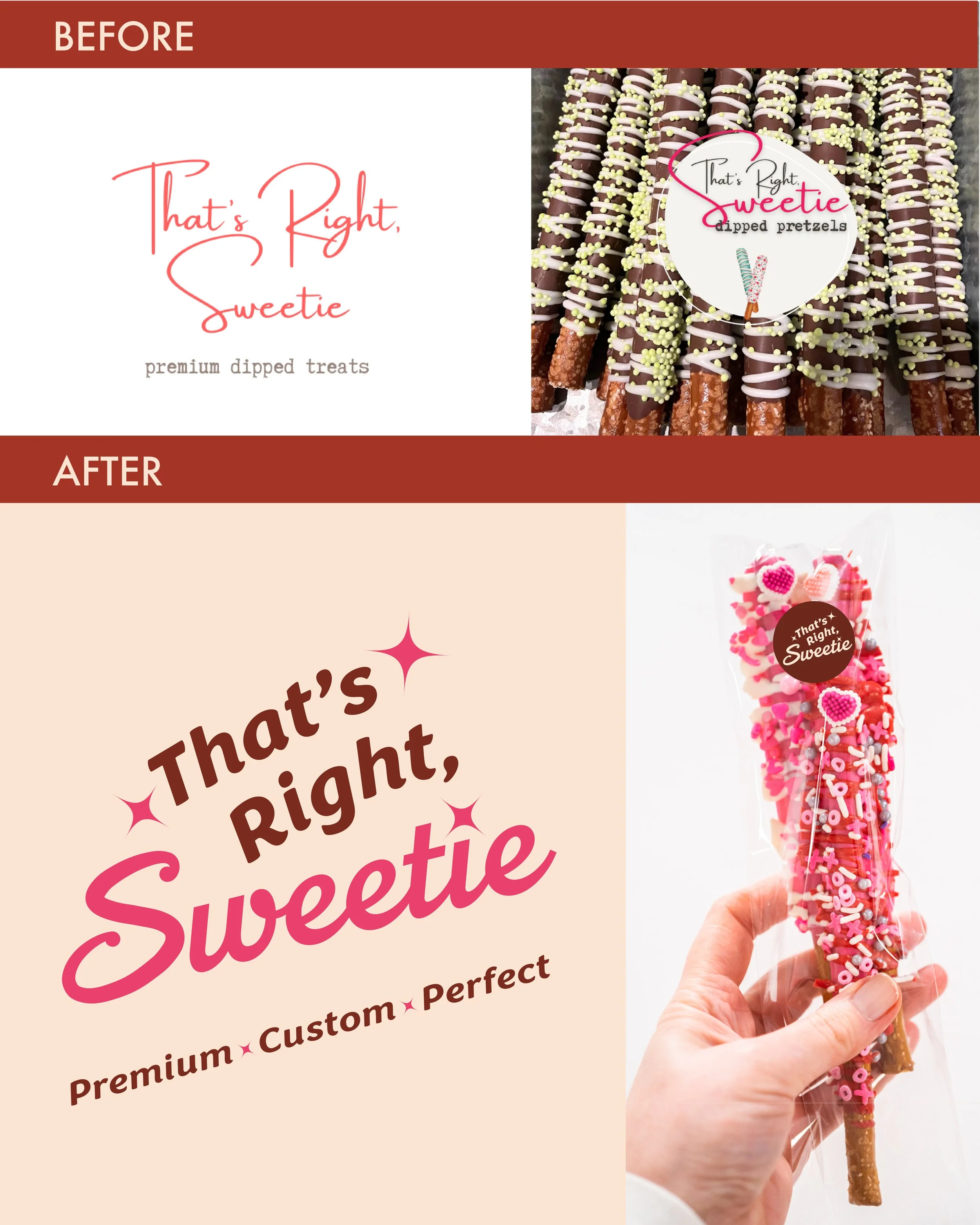
That's Right, Sweetie built their reputation on precision craftsmanship: hand-dipped confections that deliver premium quality in every bite. But their visual identity was actively undermining that promise.
Their original script logo created three critical failures:
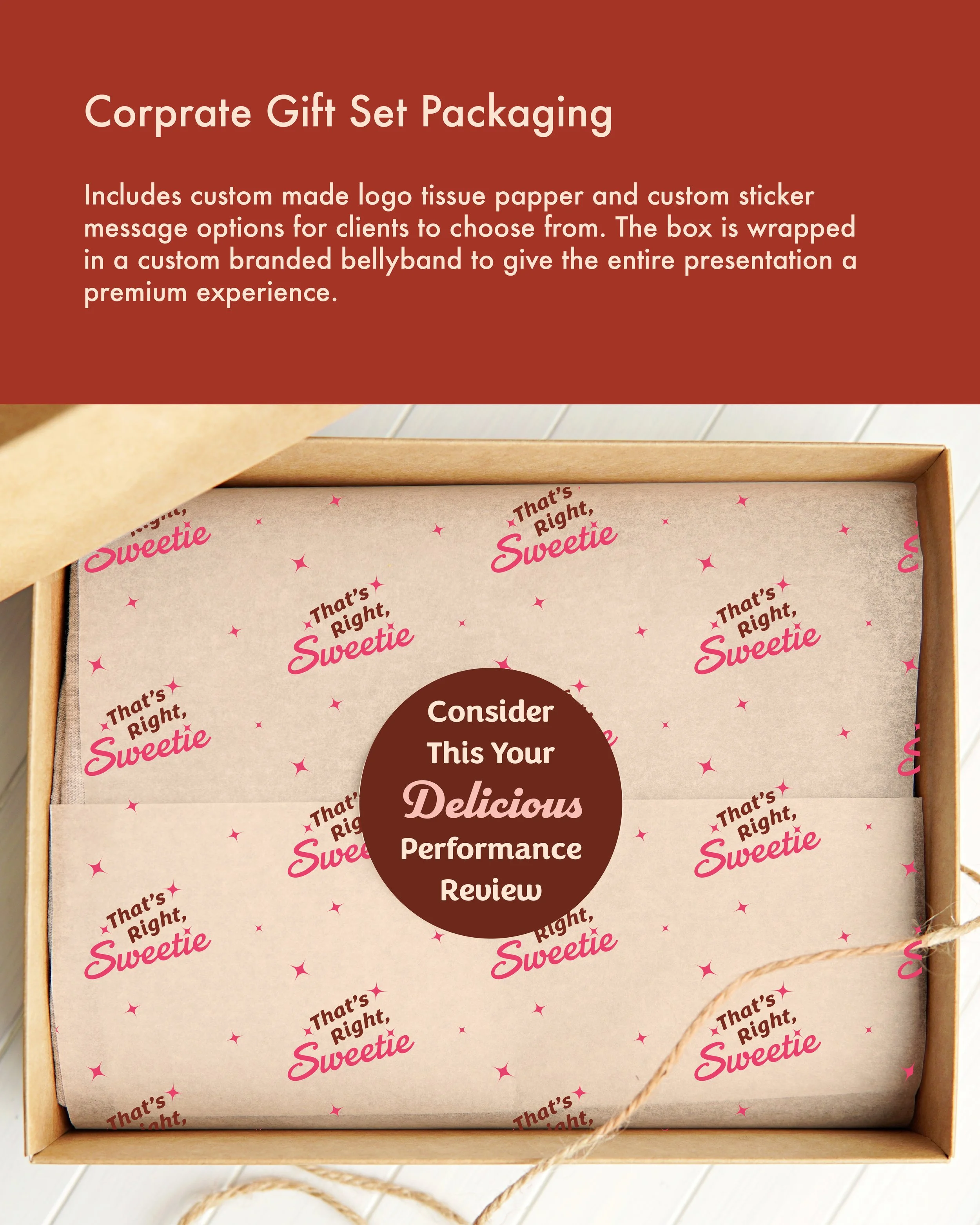
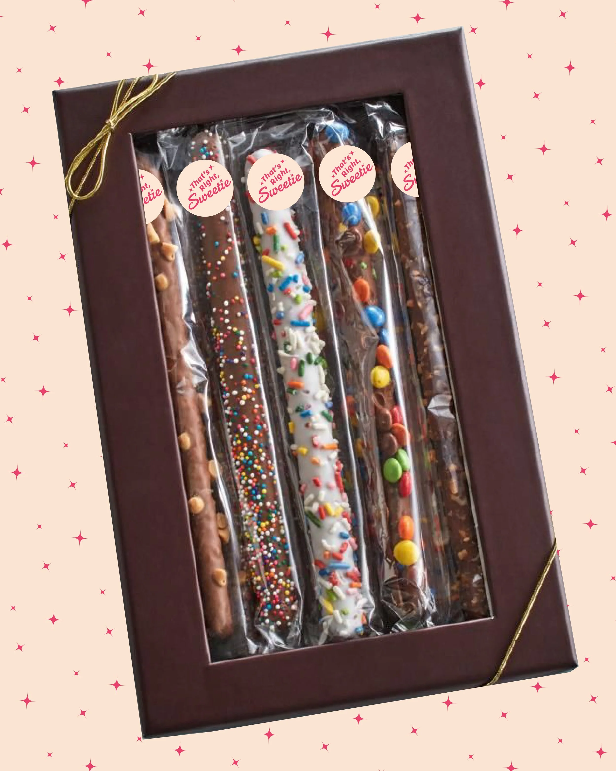
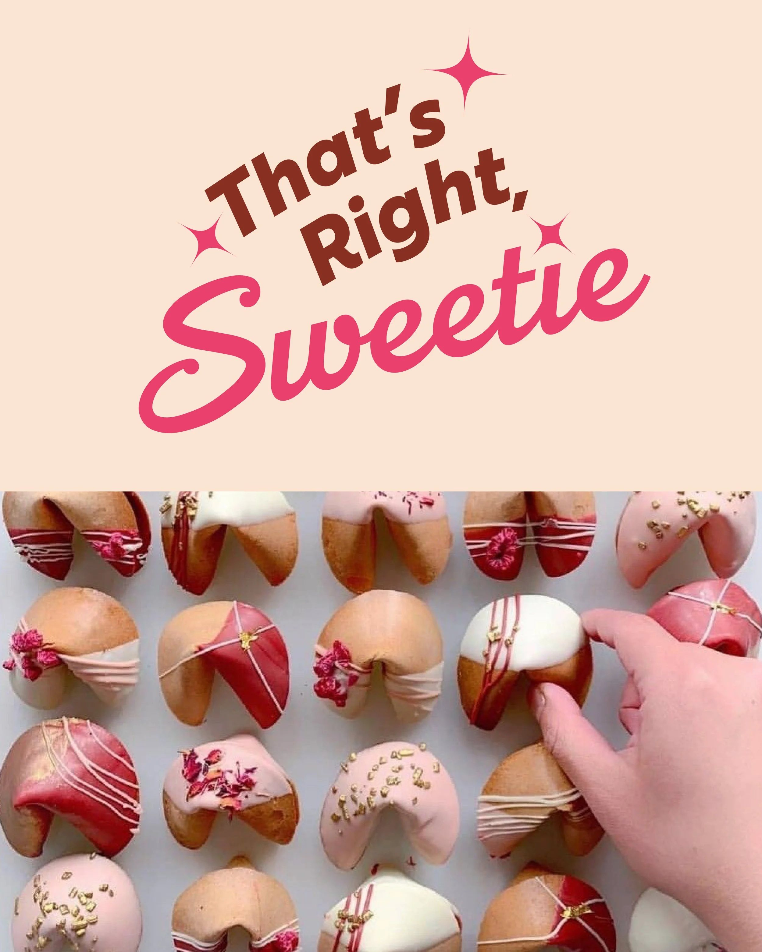
Reproduction breakdown: Delicate stroke weights couldn't reproduce cleanly at their signature 1" sticker size, the branded touch on every individual confection
Readability collapse: Extreme size contrast between capitals and lowercase made the brand name illegible at production scale
Brand dilution: Multiple inconsistent logo variations had proliferated across applications, fragmenting recognition and creating visual chaos
For a brand competing in the premium confectionery market, every touchpoint matters. When your logo fails at the exact moment of product delivery (when customers unwrap their purchase), you're not just losing brand equity. You're contradicting your core value proposition.
The alternative was unacceptable: continue with a visual identity that looked amateur despite premium pricing, or invest in a comprehensive brand identity system designed for flawless performance.
Solution: Strategic Brand Architecture with Mid-Century Glamour
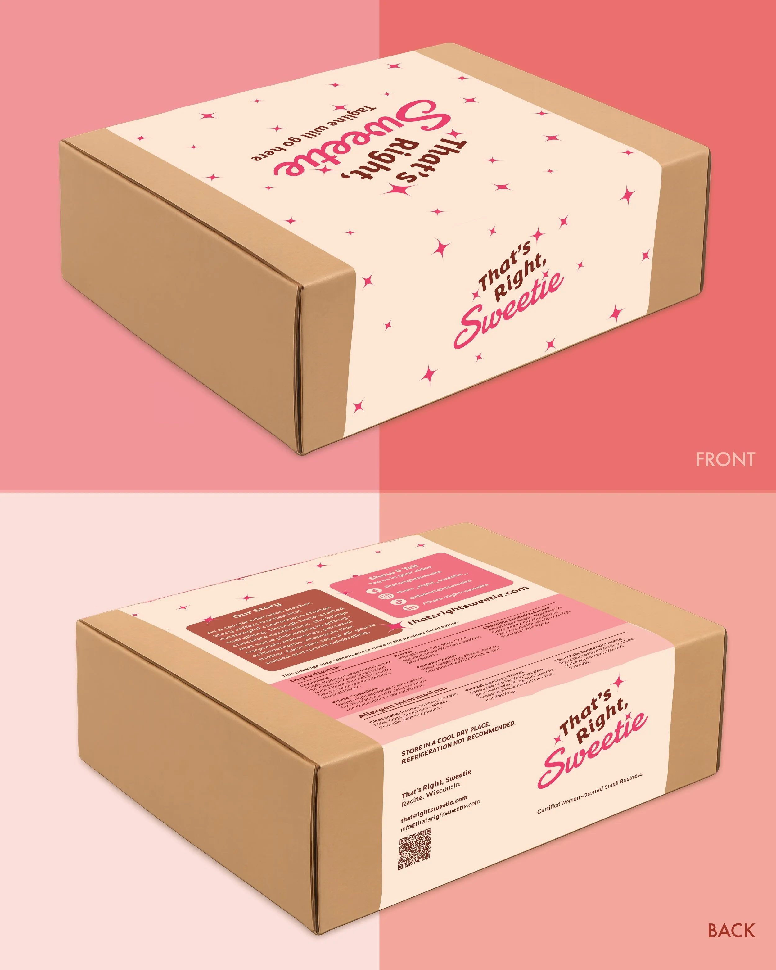
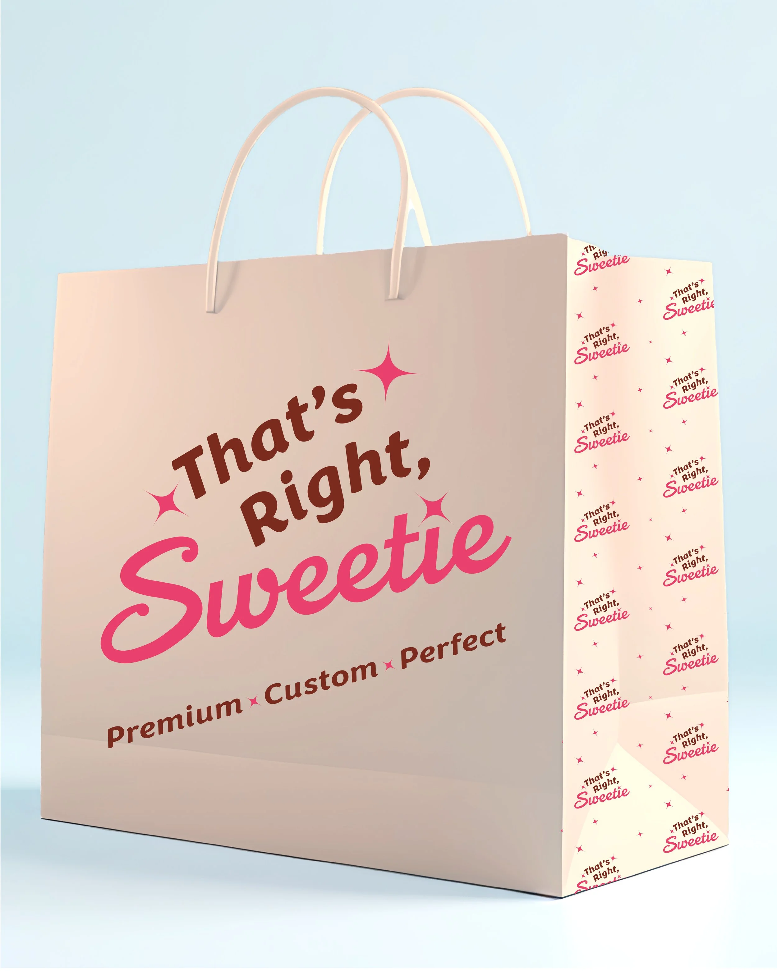
We developed a complete brand identity system anchored in a mid-century Vegas aesthetic: that 1955 intersection of celebration, optimism, and unapologetic glamour. This wasn't nostalgic decoration; it was strategic positioning that authentically mirrored the brand's essence: handcrafted luxury with personality.
The Technical Foundation:
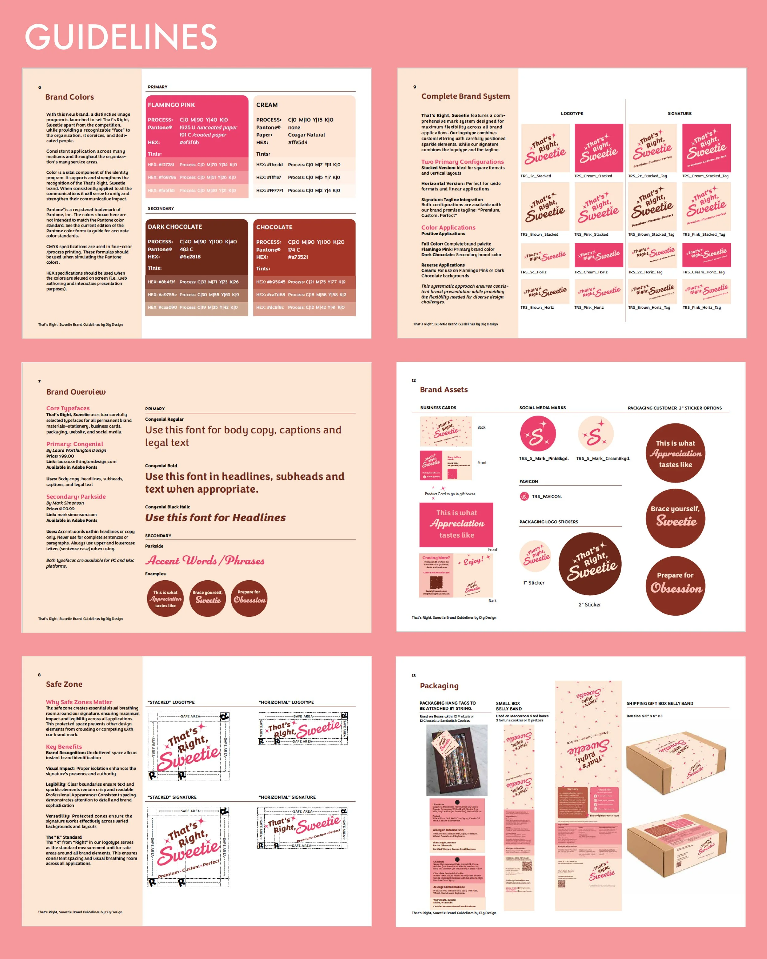
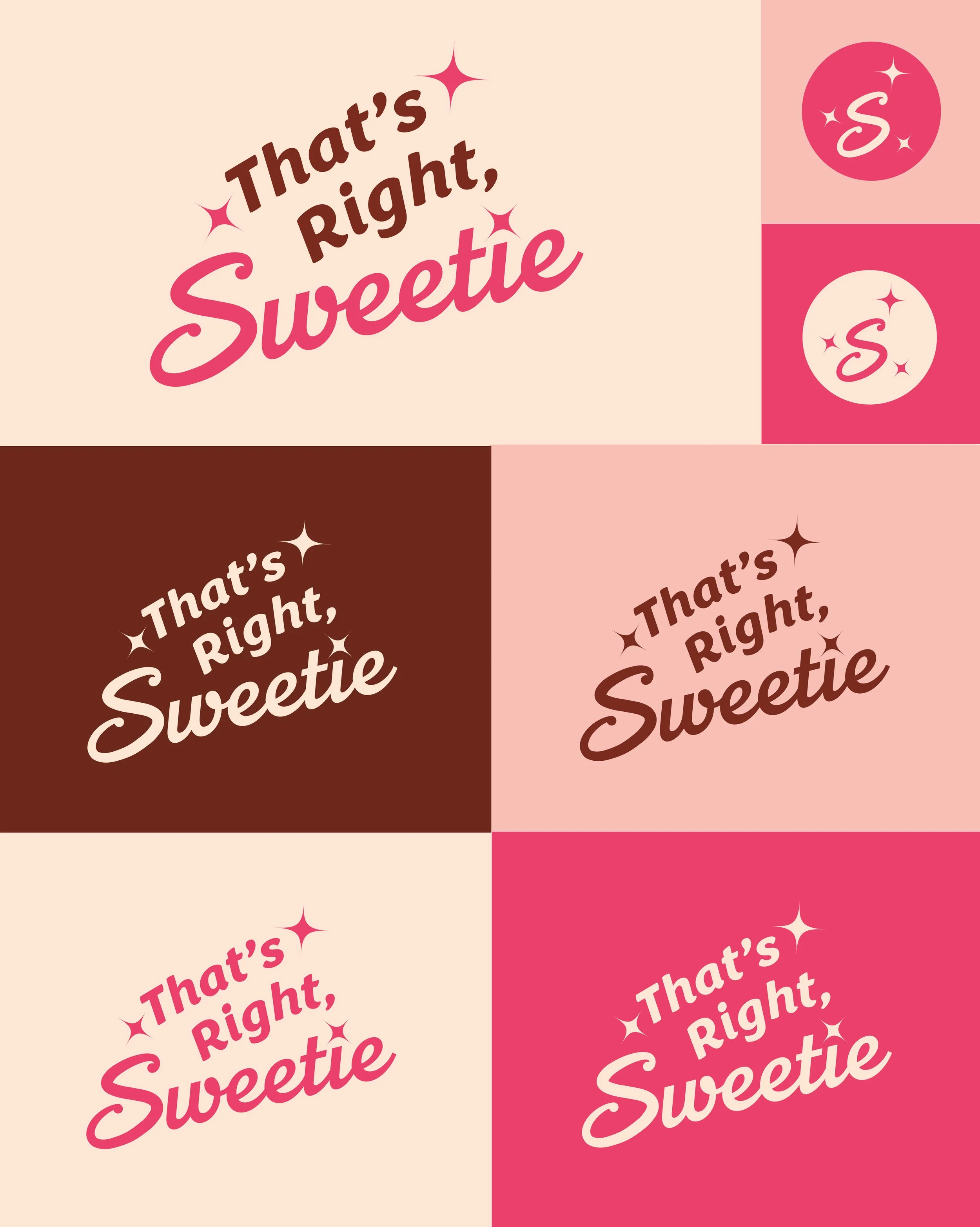
Dual-typeface system: Balanced contrasting energies while solving functional requirements at every scale
Kinetic baseline: Upward-angled architecture that creates forward momentum and reinforces optimism. Directional intent, not decoration
Production-first stroke weight: Dramatically increased weight distribution engineered specifically for 1" diameter reproduction fidelity. Every stroke was stress-tested at production size to guarantee legibility across all substrates.
Why this approach was the only solution: Off-the-shelf logo modifications or typography tweaks wouldn't address the fundamental performance requirements. The brand needed architecture designed from production constraints up, where form follows function meets brand expression.
Impact: A Visual System That Performs as Premium as the Product
The comprehensive brand identity program delivered:
Universal scale performance: From 1" confection stickers to large-format signage, the brand now reproduces flawlessly at every touchpoint
Distinctive market positioning: Visual differentiation that sets That's Right, Sweetie apart in the premium confectionery category
Brand coherence: Single, recognizable identity system across all applications. No more diluted variations
Professional credibility: Visual identity that finally matches the craftsmanship quality, supporting premium pricing strategy
That's Right, Sweetie now has a brand identity that works as hard as their artisans do, delivering the premium experience their handcrafted confections deserve at every customer touchpoint.