
Brand Strategy & Identity for Steelhead Collective
Services : Brand Discovery | Brand Strategy | Competitive Landscape Analysis | Audience Personas | Archetype Development | Brand Story | Visual Identity | Logo System | Brand Guidelines
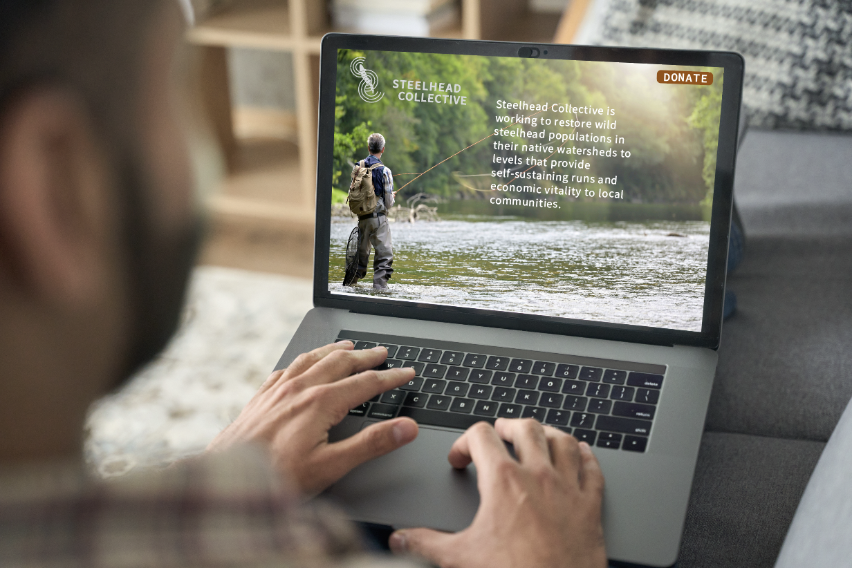
A Conservation Organization That Needed to Look Like It Could Lead One
Steelhead Collective is the only formal, funded collaboration of conservation organizations working to rebuild wild steelhead populations across British Columbia, Washington, Oregon, California, and Idaho. Before engaging Dig Design, they had a mission — and nothing else. No name recognition, no visual presence, no strategic framework to communicate what made them categorically different from every other conservation organization in the region.
They weren't a rebrand. They were a launch — and the stakes were real. Major institutional donors, partner organizations, tribal nations, and fishing businesses would all be evaluating whether this new entity was credible enough to lead.
The Challenge
Wild steelhead conservation is a crowded, visually undifferentiated space. Most organizations in this world rely on circular badges, illustrated fish, and well-worn conservation language — "sustainable," "holistic," "transformative" — that signals good intentions but communicates nothing distinctive.
Steelhead Collective's actual differentiator is structural, not emotional: they are the *only* funded collaboration in this space. They pay organizations to participate, which transforms competitive dynamics into coordinated strategy. They work under the radar, allowing member organizations to take public action in their own names while Steelhead Collective aligns strategy behind the scenes. And they focus on the work that no one else is doing — fishery management, not just habitat restoration.
The challenge was to build a brand capable of communicating all of that to a sophisticated, skeptical, evidence-driven audience — without looking like every other conservation badge in their orbit.