
Brand Strategy & Identity for Steelhead Collective
Services : Brand Discovery | Brand Strategy | Competitive Landscape Analysis | Audience Personas | Archetype Development | Brand Story | Visual Identity | Logo System | Brand Guidelines
They had a mission. They needed a brand.
Steelhead Collective, a Multiplier project, is the only funded collaboration of conservation organizations working to bring wild steelhead back — across British Columbia, Washington, Oregon, California, and Idaho. When they came to Dig Design, they had no logo, no visual identity, and no way to tell the world why they were different.
This wasn't a rebrand. It was a launch. And the audience; major donors, partner organizations, tribal nations, fishing businesses — would be watching closely.
The Challenge
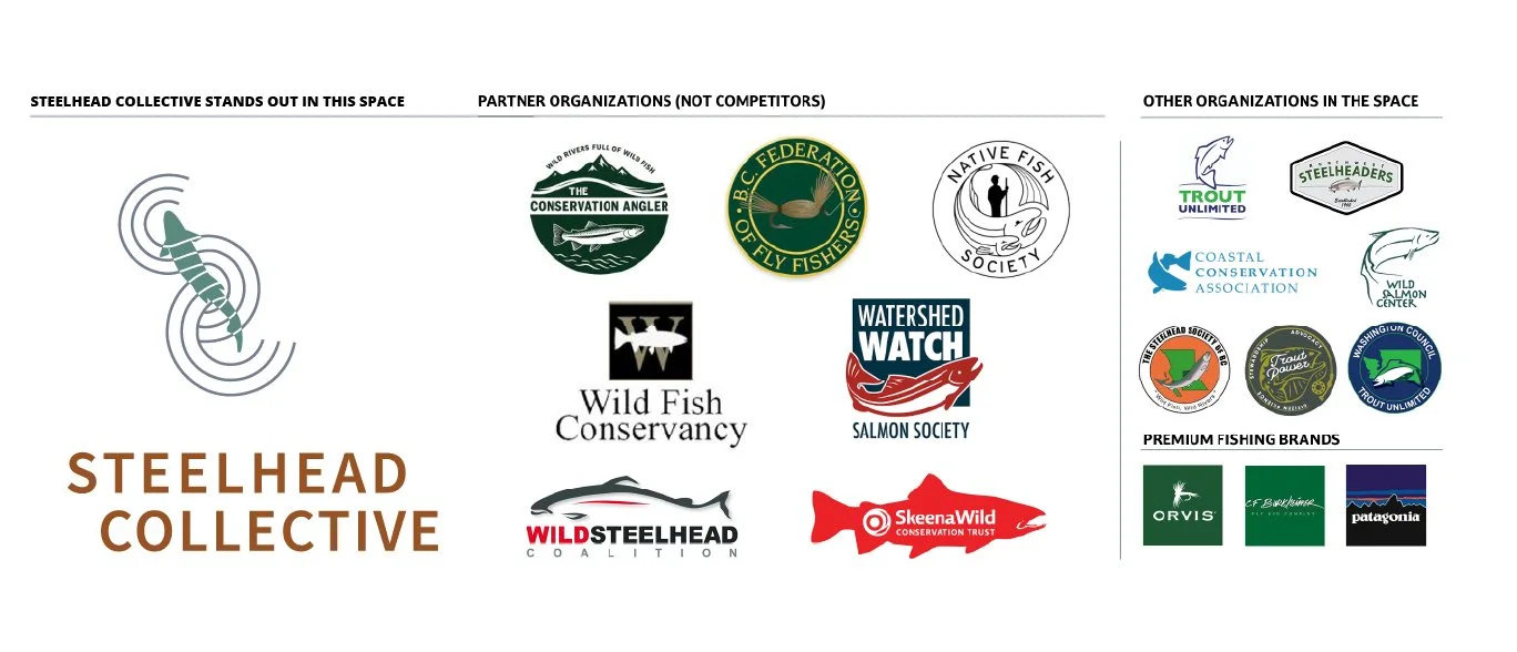
Look at conservation branding for about thirty seconds and a pattern emerges. Circular badges. Illustrated fish. Words like sustainable, holistic, transformative. It all blurs together.
Steelhead Collective is genuinely different — structurally, not just philosophically. They're the only organization that pays conservation groups to collaborate, which turns competition into coordination. They work quietly behind the scenes, letting partners take credit publicly. And while everyone else is focused on habitat, Steelhead Collective is tackling the piece nobody else is: fishery management. Because good habitat alone doesn't bring the fish back.
The people they need to reach are smart and skeptical. They've seen a lot of organizations promise a lot of things. The brand had to earn their attention and their trust.

What we built
Strategy first. Always.
Before anything was sketched or colored, we did the thinking. Stakeholder sessions. A brand sort. Deep research into the audience, the competition, and what this organization actually stands for.
What came out of that work:
Vision and Mission written to reflect what the organization actually does, not what sounds good on a grant application
Audience personas a high-net-worth donor who vets organizations for months before writing a check and a BC lodge owner whose livelihood depends on healthy fish runs
Brand archetypes The Ruler as primary (coordinating, organizing, making things happen) and The Sage as secondary (evidence-based, authoritative, never preachy)
Three brand pillars Strategic Intelligence, Collaborative Convening, Pragmatic Effectiveness
A word bank with language to use and language to drop. Out: synergy, ecosystem, passionate, holistic. In: coordinated, evidence-based, integrated, responsible.
A brand story built so the audience is always the hero. Steelhead Collective is the guide with the plan.

A mark worth noticing
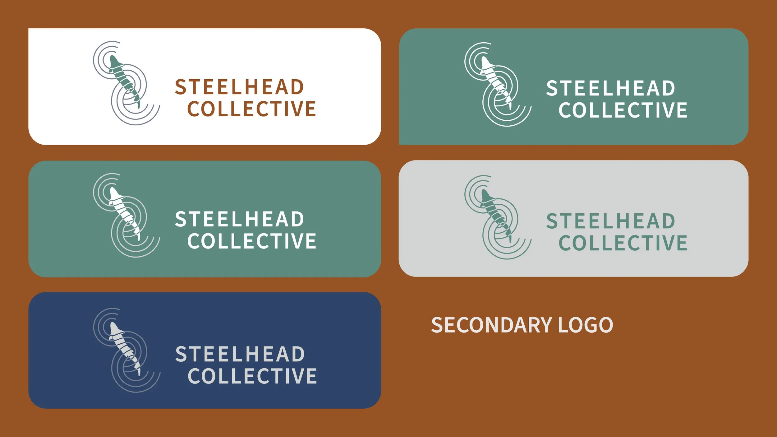
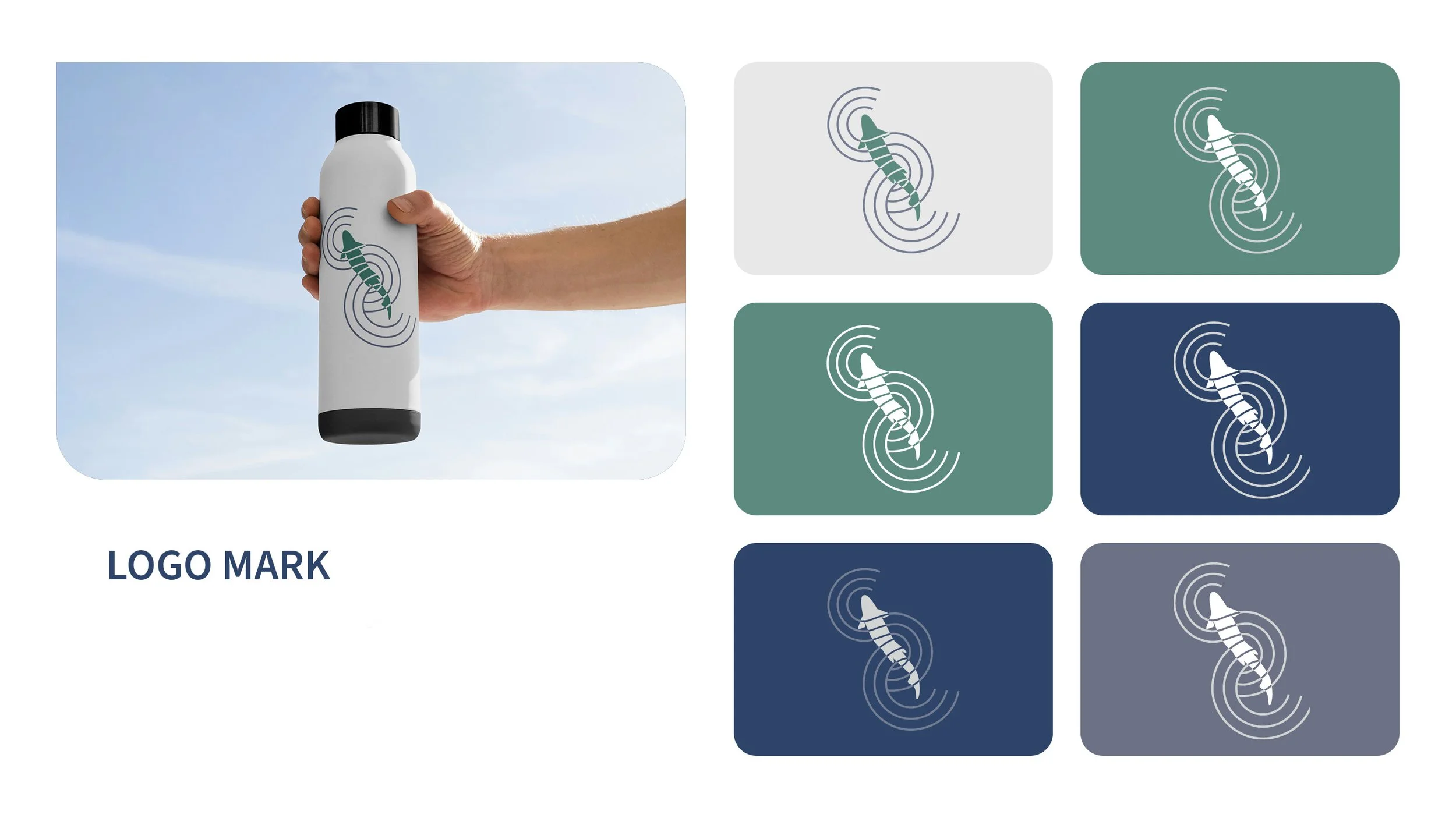
The logo is an abstract steelhead wrapped in concentric ripple rings. It reads as a fish in motion. It reads as sonar. It reads as the ripple effect of organizations finally working together. It is not a badge. It doesn't look like anyone else in this space.
The outcome
Steelhead Collective went from nothing to a complete brand identity — one that looks credible enough to attract major institutional funding and distinct enough to stand apart from every partner organization they work alongside.
For an organization just getting started, that's not a small thing. The brand does the work of establishing trust before a single conversation begins.