
Placemaking on the Water: Building a Brand Presence for Forward Outdoor
Services Placemaking Design; Signage, Brand Icons, Print Collateral
When Forward Outdoor took over the dock space at Discovery World, they inherited more than a location. They inherited a blank slate. The previous operator's signage was so minimal that the dock read as closed, even during open hours. Our job was to change that: to build a visible, dynamic brand presence that told people, from the moment they approached the water, exactly what they could do there.
This was placemaking work in the truest sense. It wasn't about a single sign or a single asset. It was about designing a full system that carries a visitor's eye and understanding from the top of the dock, down the ramp, to the water's edge, and out into the community at large.
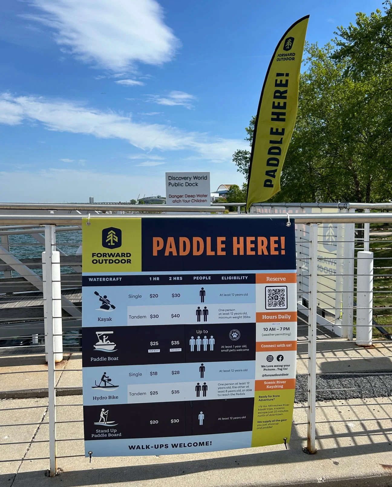
Top of the Dock Entrance
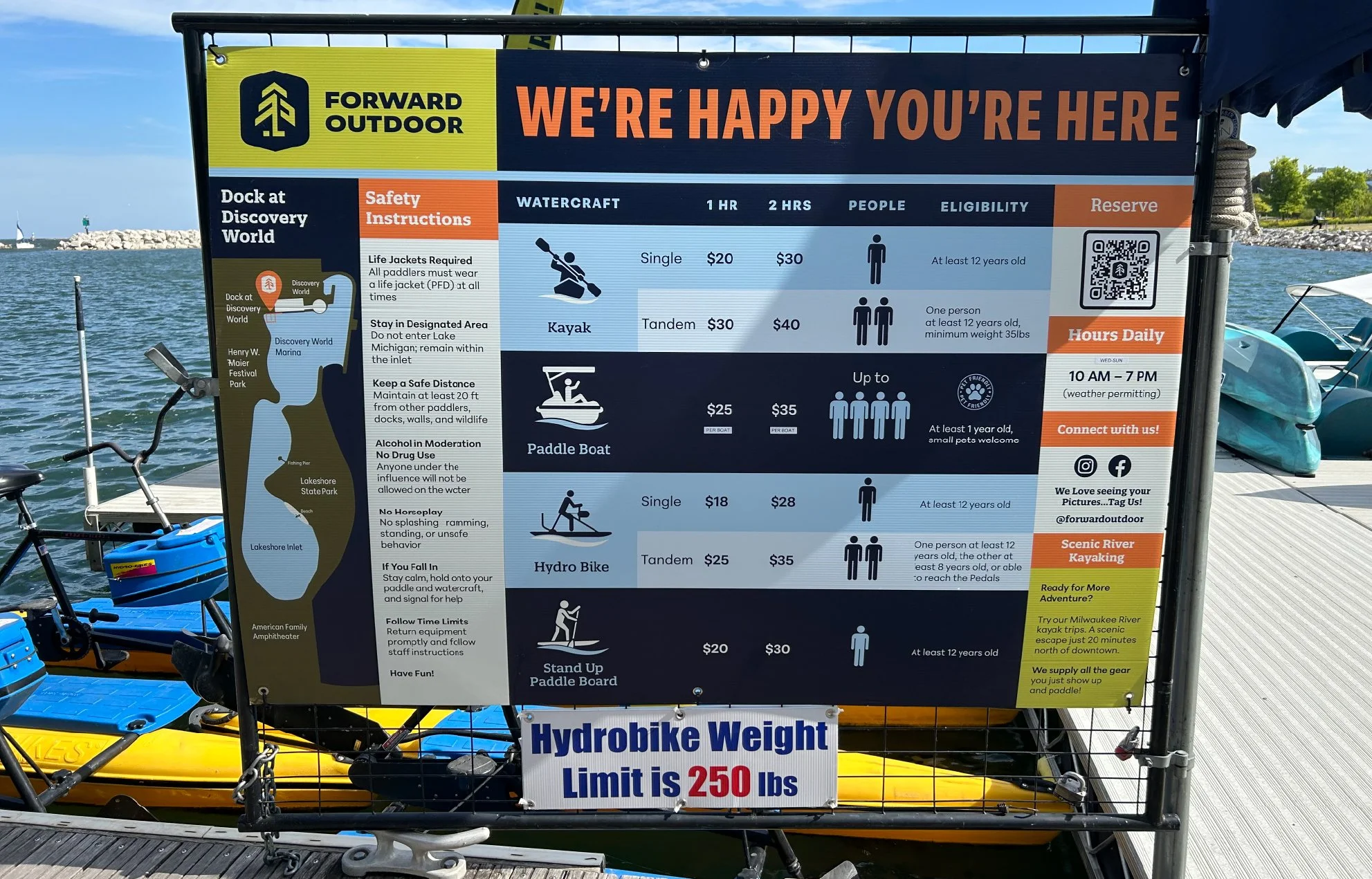
At the Water Entrance
Two Moments, One Story
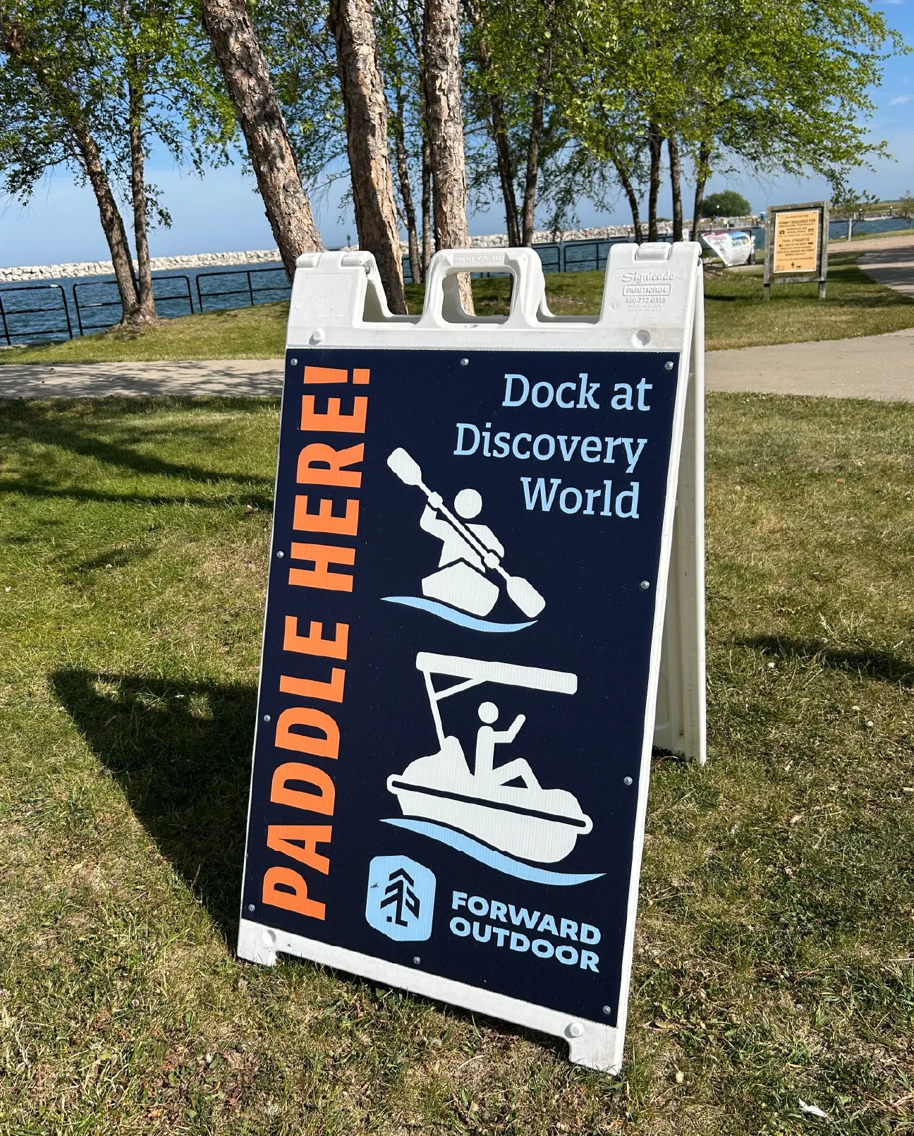
At the top of the dock, before visitors even start their walk down, we placed signage designed to stop foot traffic and answer the first question every passerby has: what is this, and can I do it right now? Feather flags do a lot of that work. They move with the wind off the lake, they catch the eye from a distance, and they signal activity in a way that static signage simply can't.
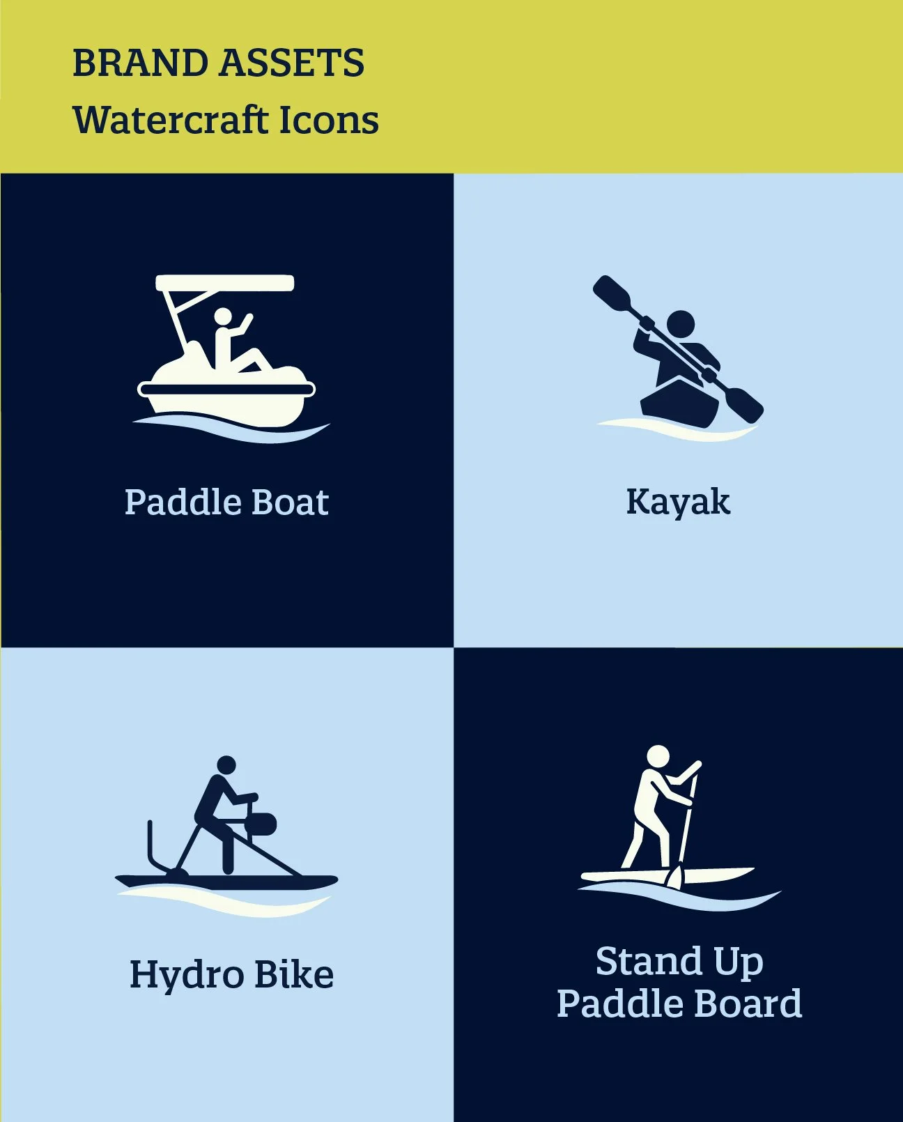
At the base of the dock, the signage gets more detailed. This is where visitors are already engaged and ready for specifics: pricing, watercraft options, how the experience works. We developed a custom icon set for each type of watercraft Forward Outdoor offers, so that someone unfamiliar with the difference between a paddle board and a paddle boat can understand their options at a glance, no reading required.
Tying it together is a headline we built and carried across every touchpoint: Paddle Here. It shows up at the dock, on the flags, and in the printed materials, giving the whole system one unmistakable, ownable voice.
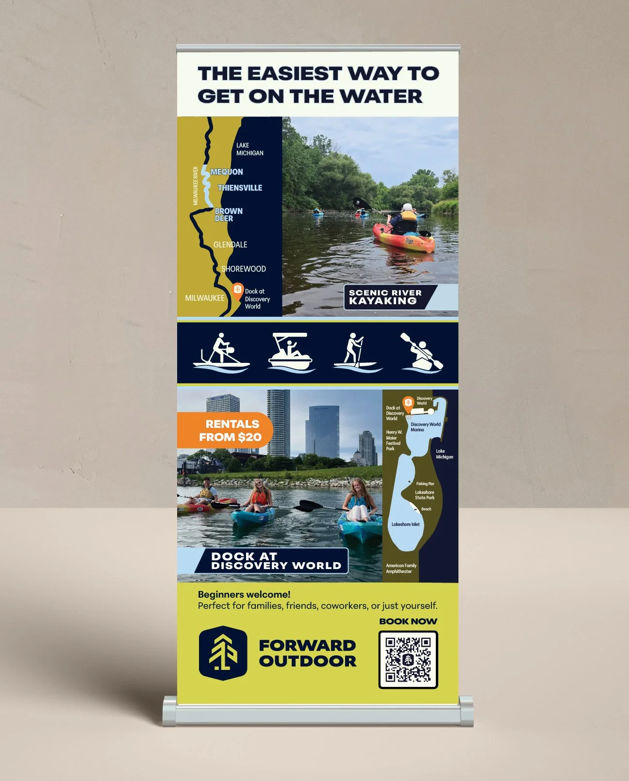
Retractable Banner
Beyond the Dock
The same system extends to Forward Outdoor's Brown Deer launch, where we adapted the signage and feather flag usage for a second location, and to their presence at local farmers markets, where a dedicated banner brings the same brand energy to a very different setting. We also built out the supporting print materials: rack cards, gift cards, and a retractable banner, all designed to work as one connected family rather than one-off pieces.
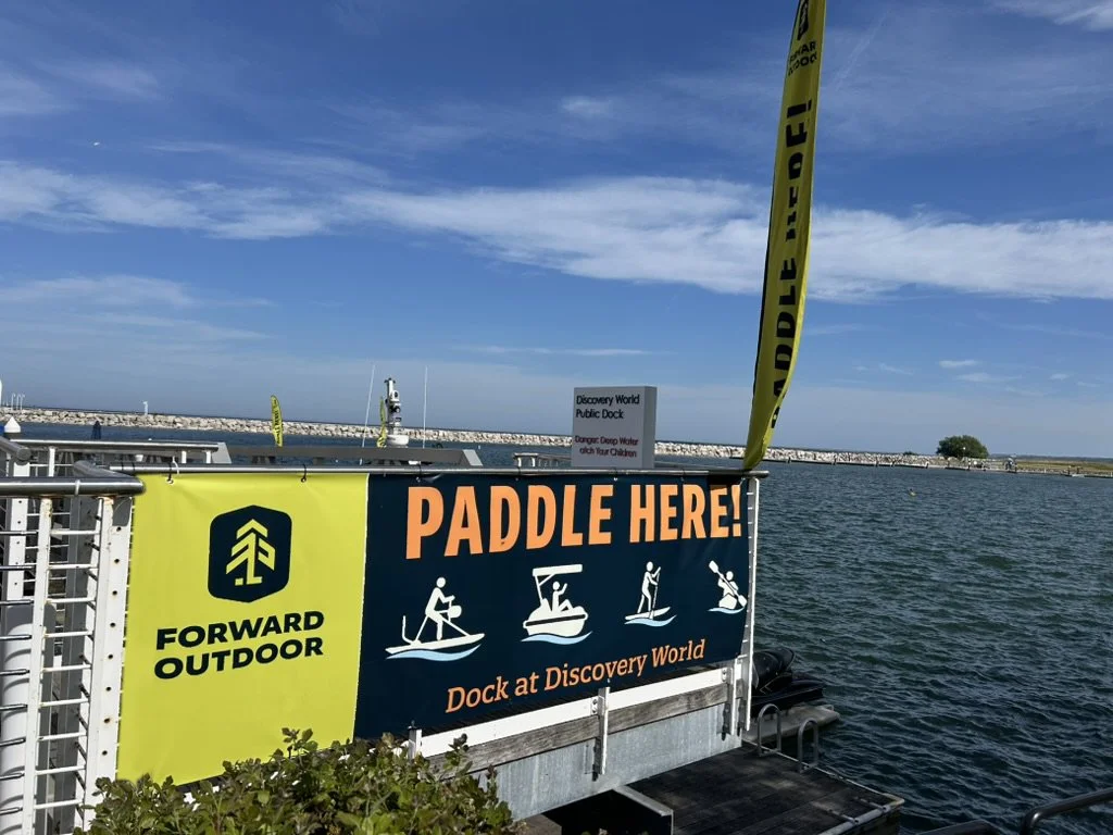
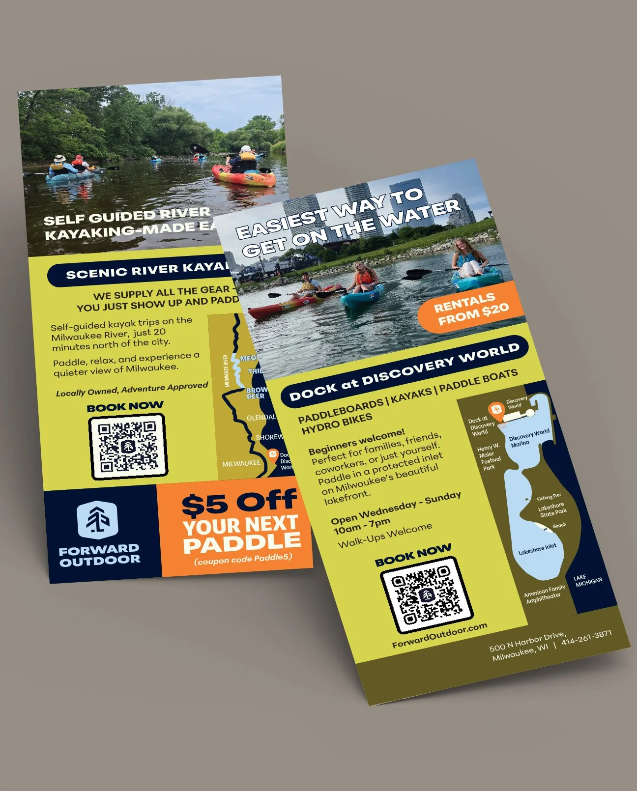
Rack Cards
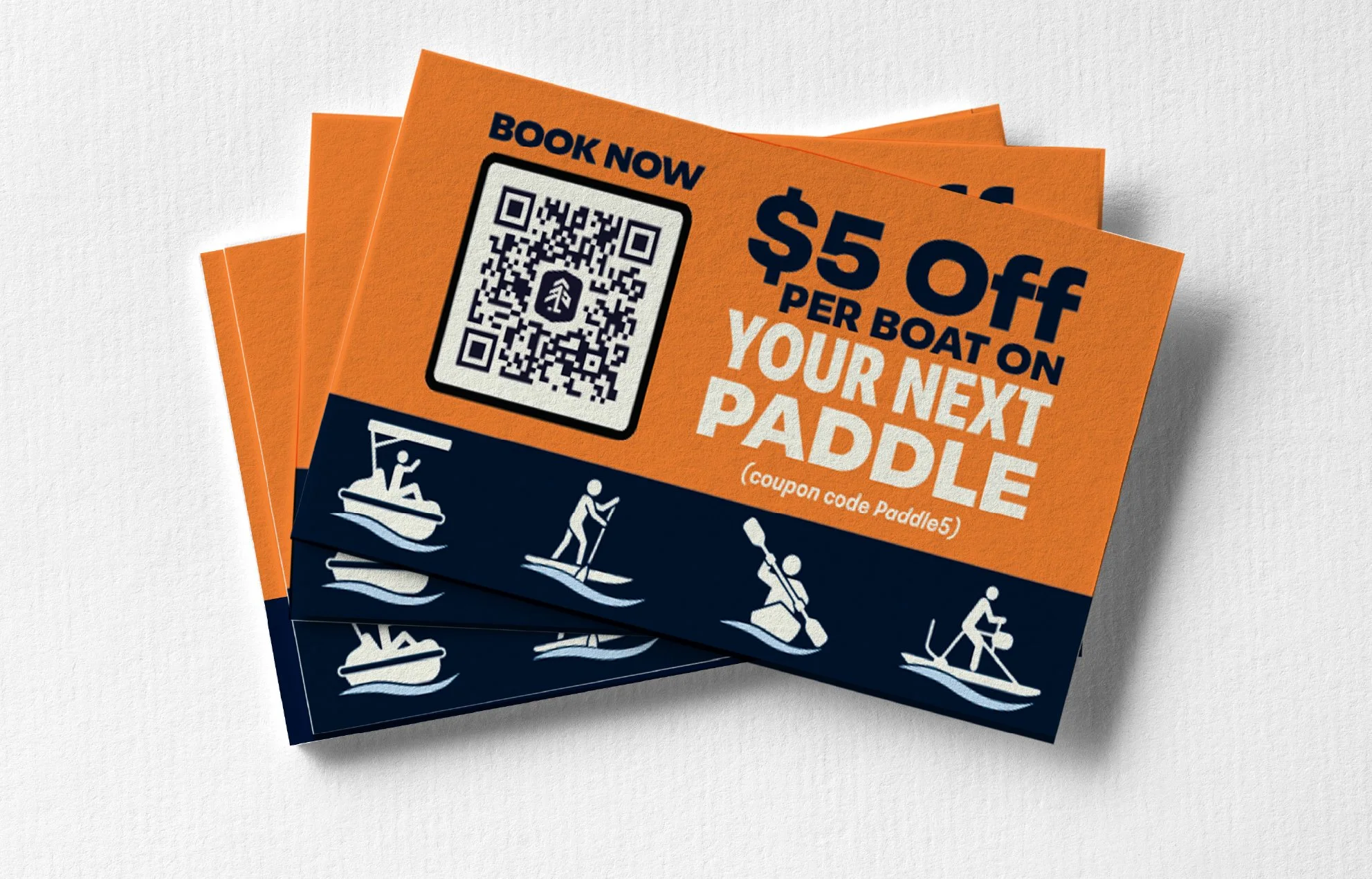
The Result
What Forward Outdoor has now isn't a collection of signs. It's a placemaking system: consistent iconography, a consistent headline, a considered palette, and materials built to move with them across every location and every season, expanding a brand that was still finding its footing into one with real, visible presence on the water.